http://www.susannauk.f2s.com/truckpics.html
cool pic of perspective on a semi.
Monday, August 31, 2009
Selecting Lights and Darks in the Levels Palette
 Step 1: The Original
The image below is an image from the subway in New York City. As you can see, the image is lacking a bit of contrast and also has a slight underexposure. It's not that bad, but it looks somewhat dirty and dark. The image has plenty of shadows, but the mojority of the highlights have been washed out in that inadequate light was present when the photo was taken. Many of the figures look like sillohuettes in the dim light.
Step 2: Setting the Black Point

We are now going to set the black and white points in the Levels settings. After duplicating the original layer, create a new adjustment layer in the Layers palette. This is the half-white, half-black circle located at the bottom of the palette.
Step 3: Black point settings
You will see a color picker. Set everything to solid black and then change the setting under "B" to 5, as shown below. This sets the black point to 95% black. Click OK

Step 4: Setting the White Point
Double-click the Set White Point tool, which is the white eyedropper. In the color picker, set for pure white and then enter 95 into the "B" setting as shown to the left and below. The white point is now set to 95% white.

Step 5: Finding Shadows
We are now ready to perform the image correction. We will click the Set Black Point tool in the darkest part of the image and the Set White Point tool in the lightest part.
To locate the darkest part of the image, hold down the Alt (Option on
Mac) key, and as you move the shadow slider to the right, the image
 should turn white. As you move the slider you will see some areas start to show through. This is the Black
  Point threshold, as show to the left. The areas that start to show are the darkest areas of the image.
Step 6: Adjusting the Shadows

Take note of where the dark portions of the image are on the threshold and return the slider to the far left. Choose the Set Black Point tool and click on the darkest portion of the image in the main image window as shown in the image to the right. The image will be shifted and the area we clicked on will now be set to the 95% black that we selected earlier.
Step 7: Finding Highlights
Hold down the Alt (Option on Mac) key and move the right slider to the left to reveal the whitest point of the image. The image will
 begin as black and the highlight areas will show through as shown below.
 Step 8: Adjusting Highlights
Choose the Set White Point Eyedropper tool from the Levels palette. Click on the whitest area of the image as shown below. The lightness of the image will be adjusted to match.
Step 9: Setting the Gray Point

The tonal qualities of the image look much better now and the colorcast is reduced a bit. Now to totally remove the color cast. Choose the Set Gray Point eyedropper from the Levels dialog box (below). When we click on the image with this tool it will choose the selected area as the gray point of the image and balance all the color to match. Click on a portion of the image that should be a neutral gray, such as the ladies pants. The colors will shift; if you are not happy, keep experimenting by clicking the Set Gray Point tool in different parts of the image.


When you are happy with the result, click OK to apply the Levels to the image. You have now learned how to use the Levels tool correctly. The image below shows the final corrected image, a huge improvement from the original. Now the figures can clearly be seen without being lost in the shadows of the image.

This tutorial was created by (Josh Halford, David Short, and Wendi Williams)
We chose to create a tutorial on how to create and use actions in photoshop.
Here is the link to our tutorial. http://createanaction.blogspot.com/
Wendi was responsible for writing the different steps out and taking the screenshots of all the steps.
Dave was responsible for finding the example images and and resizing the captured screenshots.
Josh was responsible for designing and putting all of the steps into the tutorial format.
-David Short

Kyle Kortvely and I (Brittany Howard) decided to make a tutorial about removing blemishes with the Healing brush and Spot Healing brush tools because we enjoyed our last project.
Here is a link to our tutorial.
http://blossomedgarden.blogspot.com/
We made a lot of concepts for this tutorial, about four. We wanted to put more of a design element on it, but since it was only made for the blog, we felt a bit more constricted. We made the tutorial very easy to follow along, humorous and cheery. We decided to use more than five images because we wanted to make someone who wasn't very familiar with photoshop could easily follow along.
For our process we wrote down everything we wanted to include in the tutorial by actually doing the steps as we went along, pretending we were the user.
After that, we made the screen shots, and also added some personal notes on the images. So that the person would still find the tutorial fun and helpful.
Finally we just placed the images and text together on the blog, edited the HTML a bit so the tutorial would post, and that was that.
Brittany wrote the tutorial, and Kyle did the screenshots, and photoshop editing. We both decided how best to place the images and text together.
-Brittany Howard and Kyle Kortvely
Monday, August 24, 2009
Content Aware Scaling - Cece, Kristin, Rosy, Steven
Blogger doesn't seem to like flash... so here is a link to the tutorial xxxx

LETS DO THIS
- Researched various tutorials
- Began a document via Adobe Illustrator
- Composed images needed for our tutorial
- Compiled the proper text explaining the steps in the images
- Added aesthetic elements such as drop shadows to make the images feel off the page instead of flat.
- Touched on the title to pop it out
- Enclosed an ending statement
-FIN-
Jessica Pecoraro and Adam Bentley - Photoshop Levels Tutorial


Adam and I decided to stick with a simple and understandable approach. We chose to stick with basics at first, and ended up learning ourselves on the way. Overall we did a pretty decent job and I feel we learned, yet again, more about photoshop.
Tuesday, August 18, 2009
Fianlly i changed the picture to black and white and played with the levels, reducing some yellow i think... now that it was all grayscale it was easier to fix the brown stuff in the corners. then i enhanced the levels and put on a new boarder.
Monday, August 17, 2009


Photo Restoration Project
I have absolutely no old photos of my own, so I had to resort to the grand ol' google. I found a few decent selections, each at least 50 years old (to the best of my assessing abilities), and this is what I managed to pull off:
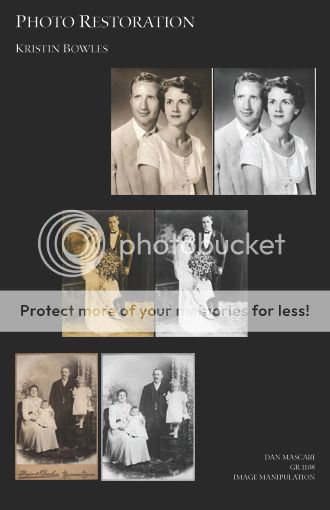
Here I have all three images, and the "restored" version I worked on for them.
The first was a very simple restoration. The photo itself maintained overall accurate texture, so the only necessary editing was to the color (the black and white had faded to a brown) and contrast. After that, there was just a little bit of dodging to bring out parts of the husband's jacket that had started to lose definition after the conversion to black and white.
This next one is a picture of a 20's couple, I believe. The photo was severely discolored, but managed to hold on to a lot of the value of the original image. I converted it to grayscale and adjusted the contrast to bring out the bride's dress. I attempted to correct the darkness of the background, but even the healing brush didn't help me fix it perfectly.
This final image is an old family portrait. There was a lot of work on this one, including healing brush, dodging, burning, clone stamping, and color/tone adjustments. I spent the most time on this one and feel it is by far my most successful restoration. The larger version of it is below.
Photo Resoration

I chose my photo from google because I couldn't make it to visit any grandparents with the family photo's.I feel I did a decent job. I mainly used the clone stamp, and the healing tools, but also used the levels, brightness, and contrast. The writing on the picture made it a bit difficult to put the pieces back together, but for the most part was able to. I tried to make their faces stand out a bit more. I actually did learn a lot more about the clone stamp and was able to completely copy the right column to the left side. It was pretty cool. I'm still learning, but feel a lot more comfortable with photoshop now.
Kyle Kortvely - Image Restore

I wanted to do something that seemed different from most restoration photos. Apparently, since I couldn't find any really old photos in my house, I took one from the Internet. It seems to be in the late or mid 1800s (if not early 1900s) and had A LOT of cracks and marks in it.
It took me at least 5 to 7 hours to get this photo restored and came down to be a pain when I came a crossed some missing spots on the clothing (notably on the woman's chest). I can't say that I even touched the Clone tool on this photo due to the Healing Brush had all the modes I needed. Aside from modifying the levels, I adjusted the exposure to get a more natural lighting as best as I could.
All in all, I never really took part in restoring a photo, but I kind of found it really easy to do after the first few hours.
Photo Restore Wendi Williams

This is a photo I got from a co-worker. I used the level adjustments first to make the image darker and then proceeded to use the healing, and spot healing, and the clone tools to make the image more defined. It could use a few more hours of work but I like it. I would like to finish touching it up and give it to my friend.
Photo Restoration: Adam Bentley

I chose an image off of google to start off with. I had a bunch of old photos but when I scanned them in they became really pixelated. The first thing I did was turn it to black and white and adjusted the levels some. After that, I took the clone stamp and tried to get rid of all the fading to the left. I'm happy with the outcome.
Image Restoration
 So, instead of finding some random image on the web, I opted for using one of my own. It wasn't this damaged originally, but I had to get creative for instructional purposes.
This was capture by my grandfather, at my Marine Corps Recruit Training Graduation, back in 2004. There were better ones to pick from, but my grandfather kept the negatives and I didn't have doubles for them. Anywho, after manually damaging it, I scanned it and fixed it little by little. Aside from the clone tool, I used some smearing and softening for some of the more stubborn spots. To finish it off, I kicked the vividity up a tad. That's all I have...
- Juan

Photo Correction

This project was kind of a challenge at first but now I understand the idea but I still need to work on the tools. I still have a lot of work to do but but I'm starting to understand why prepping first helps.
Photo Restoration - Josh Halford


My main objective was to get rid of the spots and even out the discoloration. I used the burn tool quite a bit to help bump the contrast up. I selected the foreground using the pen tool and isolated it on it's own layer, and then turned the contrast of the sky down so it wouldn't distract from the girl.
photo restoration

I found this photo on the internet and used it for my photo correction assignment. First I started out with the spot healing brush tool and just went over the background areas that were more visible and then cleaned up the scratches. Then I used the clone stamp tool to get the harder spots that were more detailed. I also darkened some areas with the burn tool were I thought they looked too smudgy and I finished it off by changing the picture to a grayscale photo and messed with the levels.
Photo Restoration_Cynthia Downey

This is an old picture of my dad I found, I thought it would make the project a little more interesting if you knew who it was in the photo, so I decided on this. Mainly I used the spot healing brush tool and the healing brush tool to get rid of the scratch marks in the photograph. Then I played with the vibrance, hue/saturation, and color balance. I was trying to bump up the contrast and get rid of the yellowish color, but I still wanted that dirty old look to it. The main problem I had was with the reddish blob behind and overlapping his head, I did what I could but it still looks a little blurbish to me. I'm mainly satisfied with getting rid of the scratches, the color was extremely annoying and i'm still not satisfied with it.
♥ Cindy
Drew Grywalsi - Photo Restoration

Image Restoration: Andrew Grywalski
This is a photograph of my Grandma & Grandpa after their wedding. The image is sixty four years old and had quite a bit wrong with it. I put around two hours into restoring the photo. The hardest portion was the drapes, making sure the folds line up and restoring the missing border on the right hand side. Removing the sepia tone made the image seem more modern. I'm pleased with the overall turnout and may make a couple changes.
This is a photograph of my Grandma & Grandpa after their wedding. The image is sixty four years old and had quite a bit wrong with it. I put around two hours into restoring the photo. The hardest portion was the drapes, making sure the folds line up and restoring the missing border on the right hand side. Removing the sepia tone made the image seem more modern. I'm pleased with the overall turnout and may make a couple changes.
Photo Restoration

I chose a ridiculously hard photograph for the photo restoration project. I spent alot of time having to make up section of the missing photo. The photo has was not only old, but torn, ripped, folded, creased, and discolored in places. I used the clone stamp tool and the paintbrush tool to try and replace both missing and damaged sections of the photo.
Image Restoration

My photo was taken in the late 60's early 70's.
It's an old photo of my grandfather whom I've never met.
It was really hard to get rid of the red blob on the left side of the picture.
I really wanted to bring some color back into the picture to make it look more recent.
The picture originally was about 3 by 5 inches.
Photo Restoration


I mostly used the healing brush and the spot healing brush. I used the healing brush on 'replace' and 'normal.' I chose the photo because it seemed to have a lot of damage. I restored the color as much as possible, turning it from sepia to black and white. I think my toughest challenge was fixing the damage over her dress.
-Brittany Howard
image restoration
 I mostly focused on fixing the cracks, and then worried about the contrast after fixing the blemishes
Photo Restoration Steven Kielbasa

The major problem was the purple tint everything has, which was especially problematic in the shadows (some of which were beyond repair (man's arms)). Once the tint was removed the remaining colors needed to be brought as close to original as possible. Also the picture had a lot of dirt on it that couldn't be cleaned off prior to scanning, along with a few stains and faded spots. The picture also lost some of its clarity which needed to be enhanced.
Grandparents wedding

My grandparents wedding photo. I mostly used the clone tool to repair creases and damage. I used the polygonal tool to mask off areas to work in. To change the sepia tones to a gray scale I used the black and white conversion on the layers pallet and for the brightness and contrast I used the cuves tool on the layers pallet.
Monday, August 10, 2009
Black-footed Ferret Postcard (Project 1)


I created this postcard using 2 images (one of the ferret and one of the grass/cement) and layered them on top of each other. I also used the ellipse tool in order to create the "cloud" effect on the bottom of the front of the postcard. On the back of the postcard, I used a gradient fill to color the left-hand side. To create the postage stamp area, I used a rectangle tool, then used the magic eraser tool to create the edges.
Elyssa Baity (Mon. 6-10p)
Monday, August 3, 2009


I wanted to keep my postcard basic yet affective. I chose my backgrounds based on the environment that the sun bear is know for inhabiting. I wanted my slogan to be simple and portray the innocent and pure image of the sun bear. That back I wanted to keep in a gray scale to give a feeling of depression.
Extinction
 The group's chosen endangered species was the panthera leo persica or the "Asiatic Lion". Not really sure how we came to that choice, but it's inconsequential now.
My concept was to show the Asiatic lion slowly fading away into extinction. The organizational name(logo) was designed by Jeremy and I acquired all images from searching on Google.
For the back(or is that the front?) of the postcard, I wanted to do something a little bit different. I didn't really like the plain look on most of the templates that I found, so I designed my own. I was going for symmetric asymmetry, if that makes any sense.
But I think that's enough nonsense for now, so I'll leave it at that. Good day.
Subscribe to:
Posts (Atom)